top of page
CAMPBELL'S STOCKS
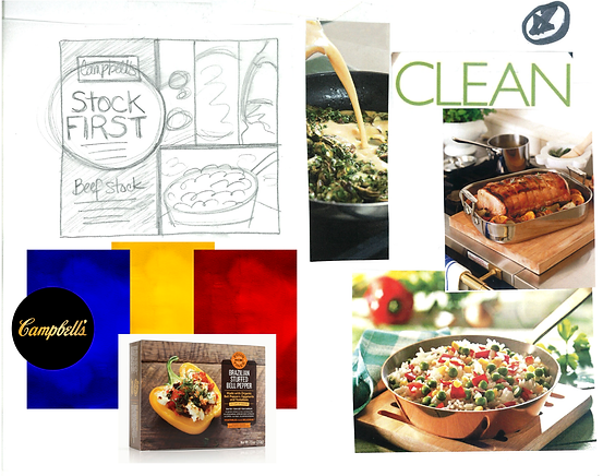
Rebranded packaging design for Campbell's Canada Stocks line. Starting with research and sketches, this opportunity grew from ideation and design execution through to photo art direction.
Campbell's Canada was looking to break away from their base product lines with a top-tier, elevated meal starter for the home chef. The rich color-code tones, in-the-moment photography, and touches of gold, richen Campbell's product's story.
Responsibilities include: Design research; Competitor review; Concept sketching; Digital design development; Production-ready files; Photoshoot art direction.


bottom of page