LOLLI LIVING
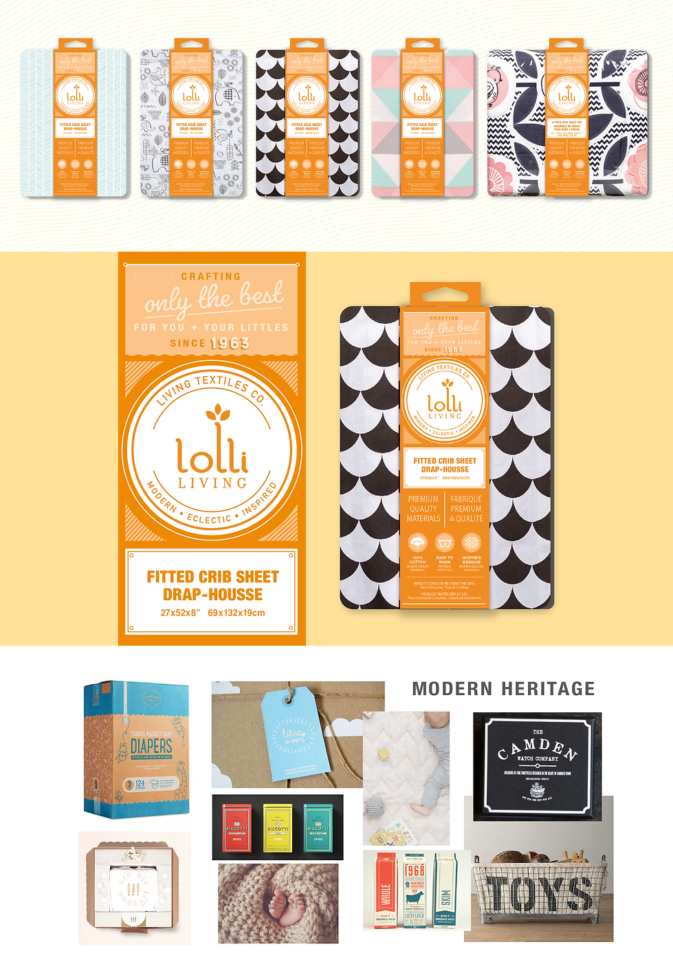
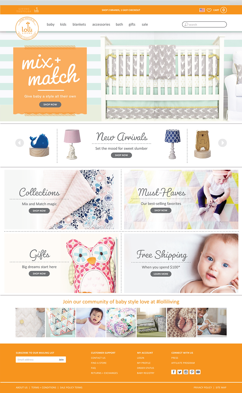
Beginning with mood boards and research, a bright, fresh look was delivered on the Lolli Living packaging and website design.
After presenting 5 directions, the mood board selected was titled Modern Heritage – leaning on the brand's over 50 years curating only the best for newborns, babies, and families. When selecting brand colors, the product portfolio was taken into consideration to cover off on two main objectives: not clashing with product, while standing out on the wall against the competition. Given price point, much of the wall was neutral and soft. Lolli Living wanted to come in bold and stylish yet approachable, and celebrate their decades of consumer trust.
Responsibilities include: Competitor research; Store evaluation; Design direction mood board creation; Packaging sketches; Digital design development; Production-ready files; Home page UI.

The website pulled in the bright and fresh tones from packaging, showcasing each section of product features. Fonts are fun and approachable; photo selections are personal and relatable. Navigation is organized into the brands' most popular product categories.
